
Love the block in the centre of outer row!

Like the second design too, but the first wins today’s vote.
read more
Love the block in the centre of outer row!

Like the second design too, but the first wins today’s vote.
read more
Snowflakes was my first thought when I did this one, but the yellow is the right colour to melt the snowflakes very quickly!

They could be lace rather than snowflakes!
read more
Lovely, and this series of designs always reminds me of Aunty Flo’s tatting.
I tried to learn how to do tatting, and tied myself in knots, and the thread, but neither me nor the thread looked anywhere near as good as her tatting!

Love both of these!
read more
I like it. These designs use similar colours to the 1970s floor covering the block designs are based on, just after the 60s orange started to become unfashionable.
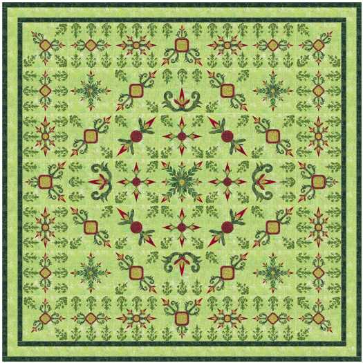
I love the second one, but am not happy with the way the quilting looks here. Perhaps my virtual thread is too thick, or the design has too much detail.
read more
Lovely!
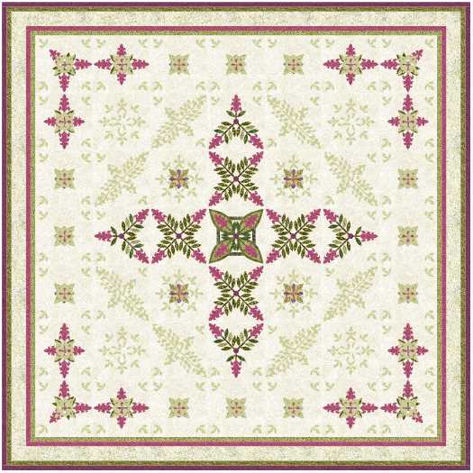
The first one is lovely, the second one is absolutely beautiful, in my never humble opinion.
read more
I don’t like this design, but I do love it!
This project file is simply a recolouring of the Lovin’ Spoonful blocks, along with a few blocks getting modified slightly.
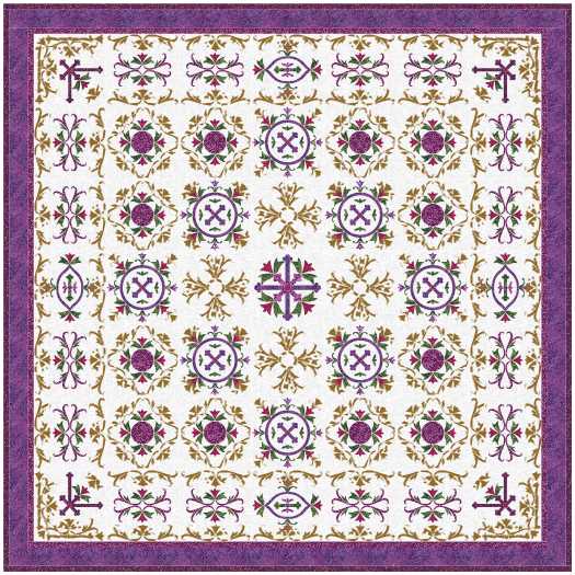
Love the second one even more!
read more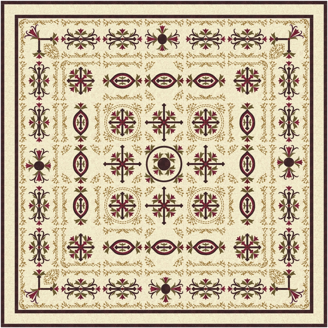
Love the first design I am sharing today.

Love the second one more … still hard to believe all these designs are inspired by an engraving on an antique spoon!
read more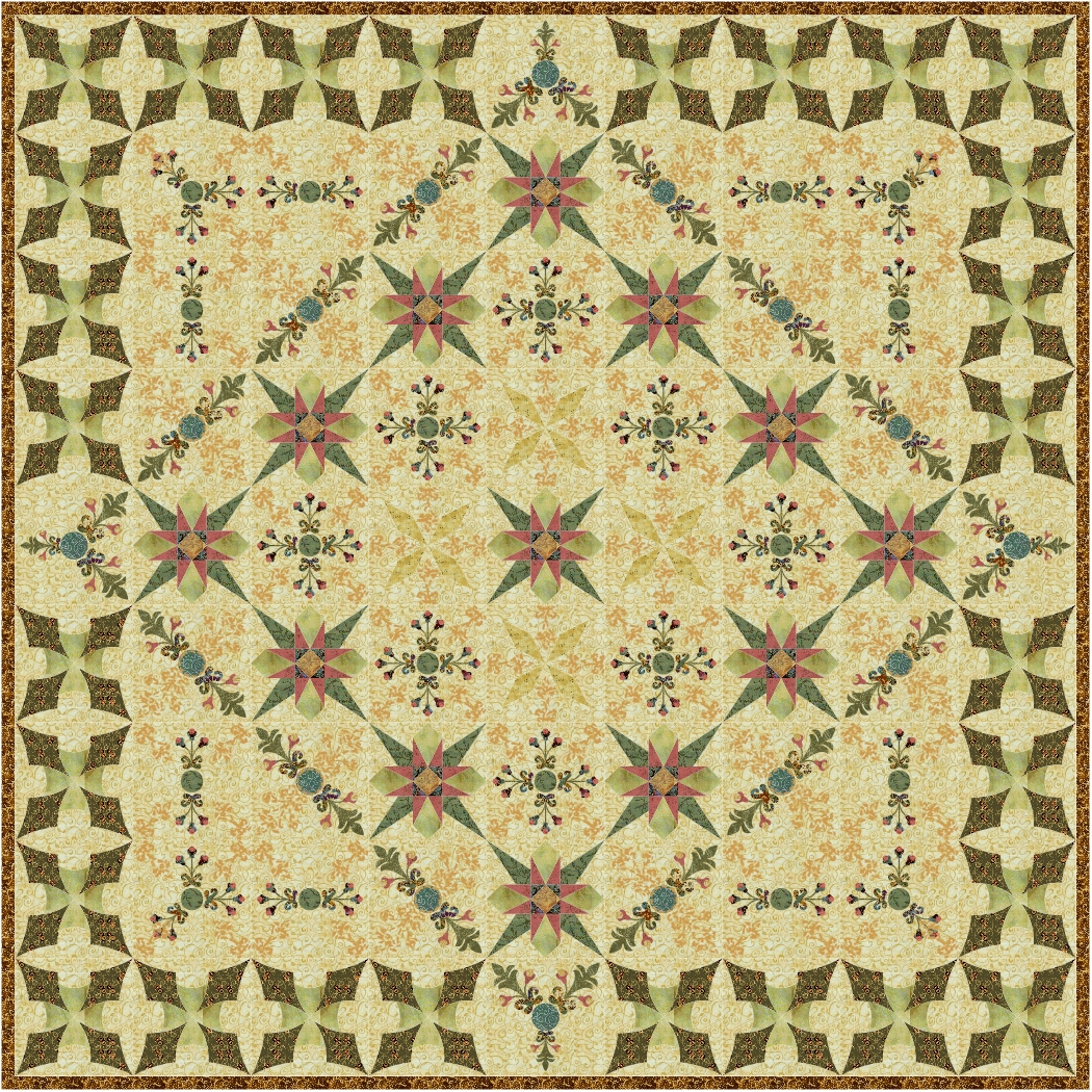
Another Aussie autumn coloured quilt … crop stubble in paddocks, dull green tree foliage covered in dust, blue skies, and in real life I can feel the cooler breezes.
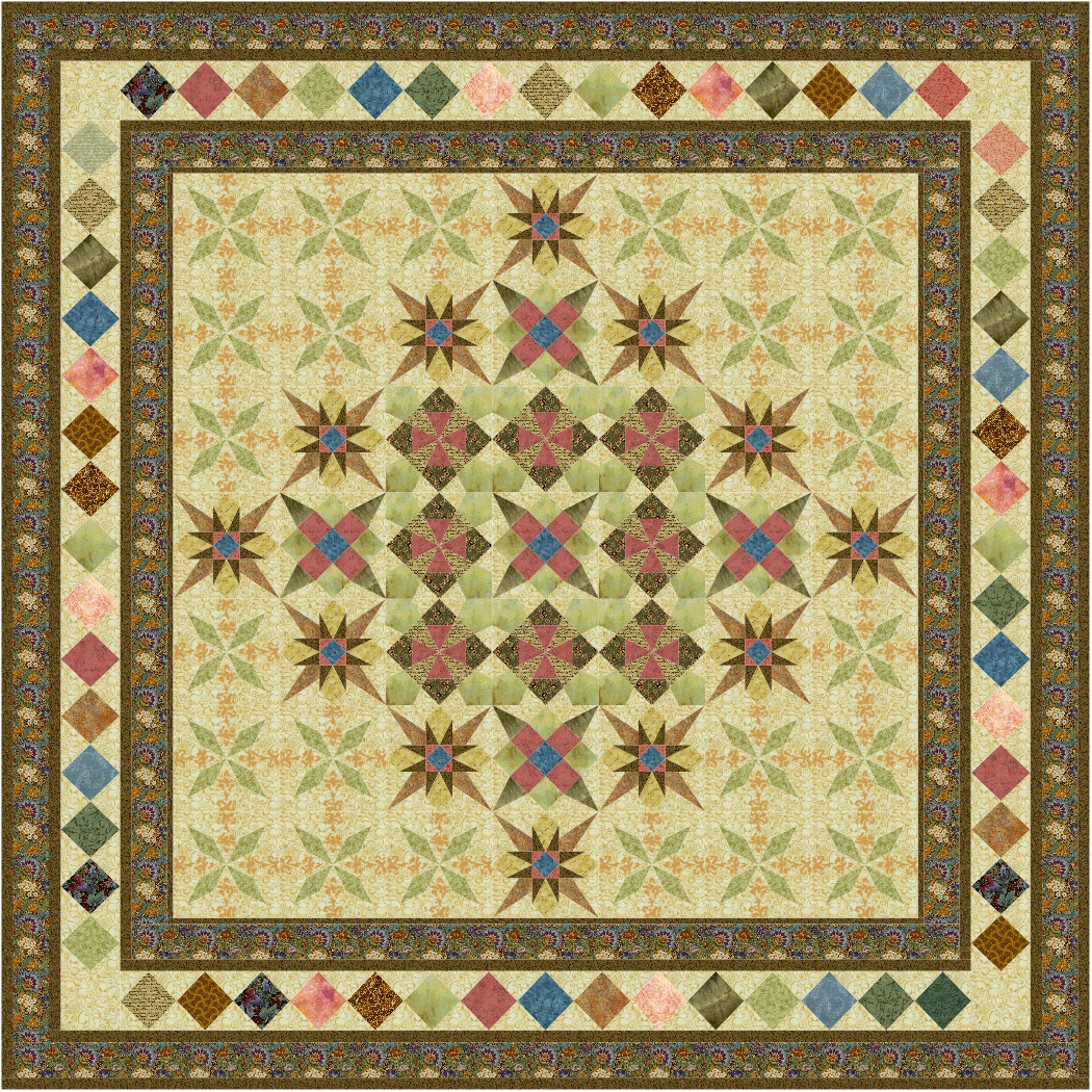
Not too sure which one I like the most, maybe the second if I added another solid border, but not too wide.
read more
I have been playing with the colour scheme of one of my favourite series of blocks. I love them, hope you do too.

Change of border, now I can’t make up my mind which colour I like!
read more
A very restful design … which is my excuse for not using the background fabric in the corners … I must have had my eyes closed!

Still blank corners, and I quilted over the cat!
read more
Yellow would not be my first choice of background colour, though I like the way it looks. these designs would look OK printed out about 3 or four inches square, laminated and hu ng on a Christmas tree … one of many uses I have found for Electric Quilt over the years.

I like the extra bit of quilting added to the second, and I would fill in the blank spaces with some straight line quilting in a thread to match the background fabric.

Love the last one!
read more
Love this one!
Happy New Year … and as this year gets underway I am about to start some new virtual projects, using the blocks I have been sorting during the last year.
First though, we are still catching up with family and friends we have not seen for a long time!

I started playing with these new blocks last year, and couldn’t wait to start sharing them, but there are a few virtual quilt designs still to share, and a lot more to find in future play sessions.
read more
Lovely!

Nive, but a bit busy for my taste. Adding sashing might help.

Busy, but I like it anyway. In a real quilt I would use a softer thread colour for the quilting which would take away a lot of the busyness in these designs.
read more
One of the things I have always loved about designing and making quilts is being able to change the colour scheme to suit the occasion, season, or the colour scheme of the room the item is destined to be used in. In particular, I love adding red, white and green, with touches of gold, to add a touch of Christmas.

And I love that even the cat on the quilt can be colour matched!
read more
At long last my home decor is starting to turn red and green, with touches of gold, as trees, swags and wall hangings are escaping from storage.

Love the second design … mainly because there is room for quilting to shine around the applique blocks.
read more
Love the first design for today.
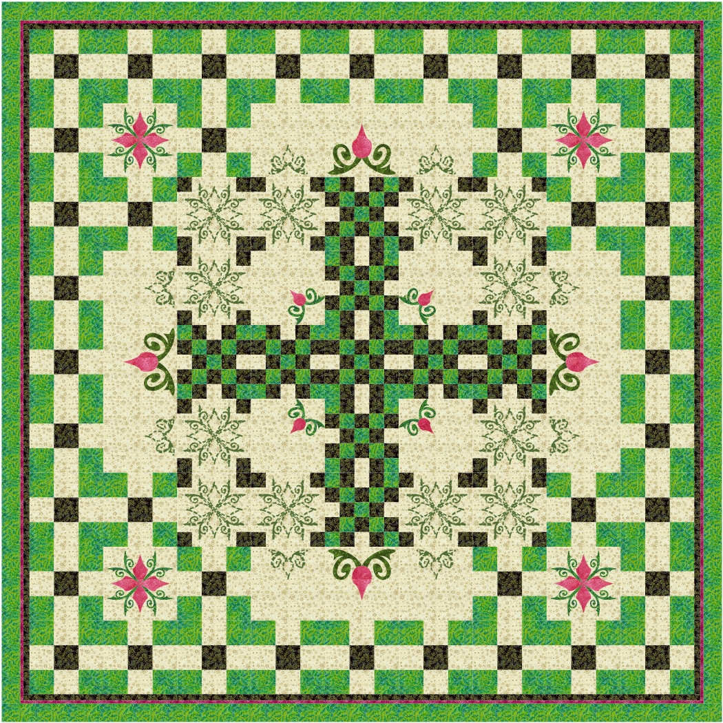
Love, love, love the second one!
Must be some Irish blood in my veins, though if that is the case I should have used shamrocks for the applique! And the quilting.
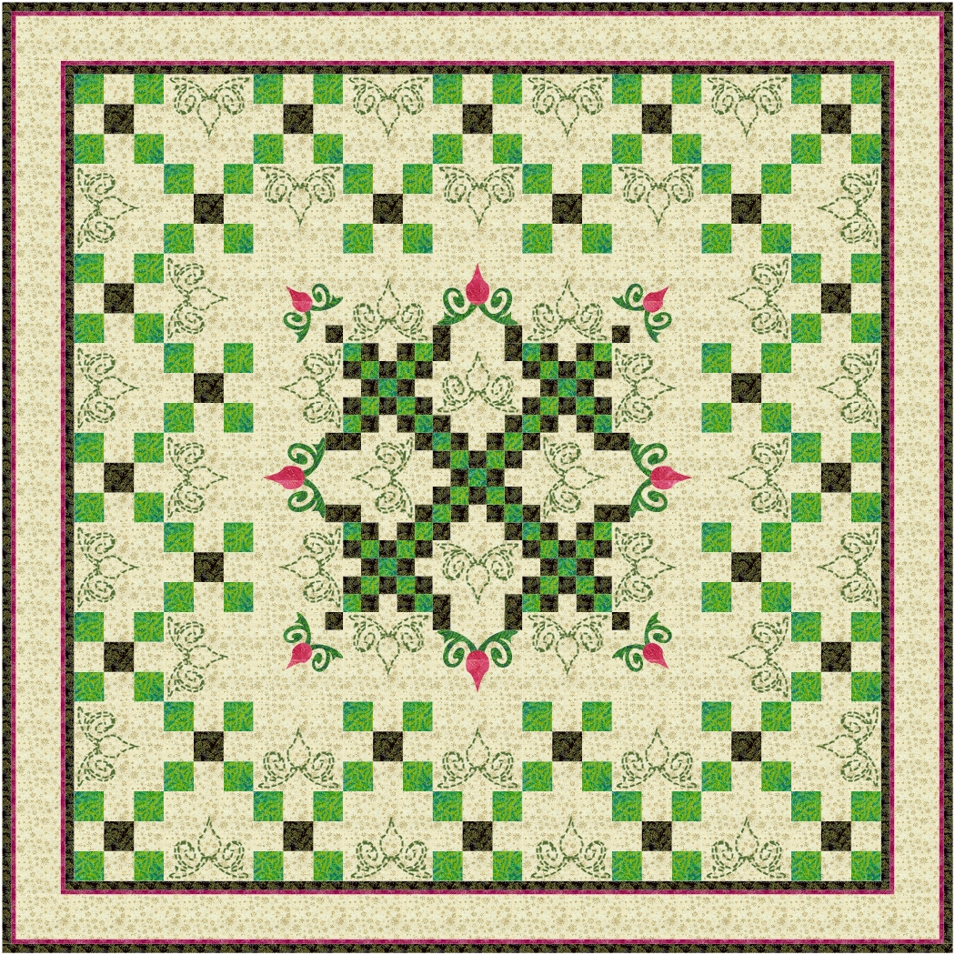
Love the last one too … or three!
read more
Love this series of designs, and these two are good examples of the standard.

I am not even going to try to pick a favourite today, but you are welcome to make a pick!
read more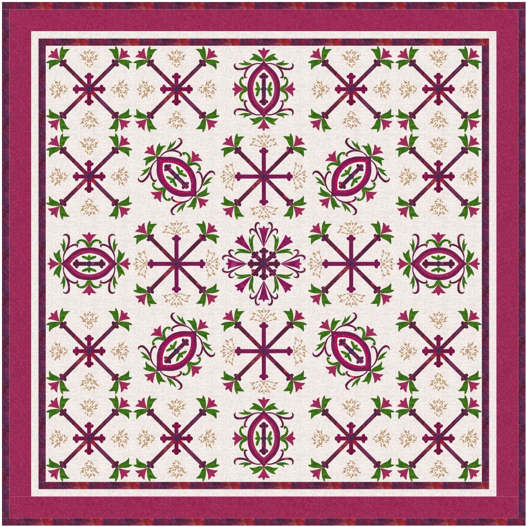
A bright version of Lovin’ Spoonful, a contrast to the original colours.
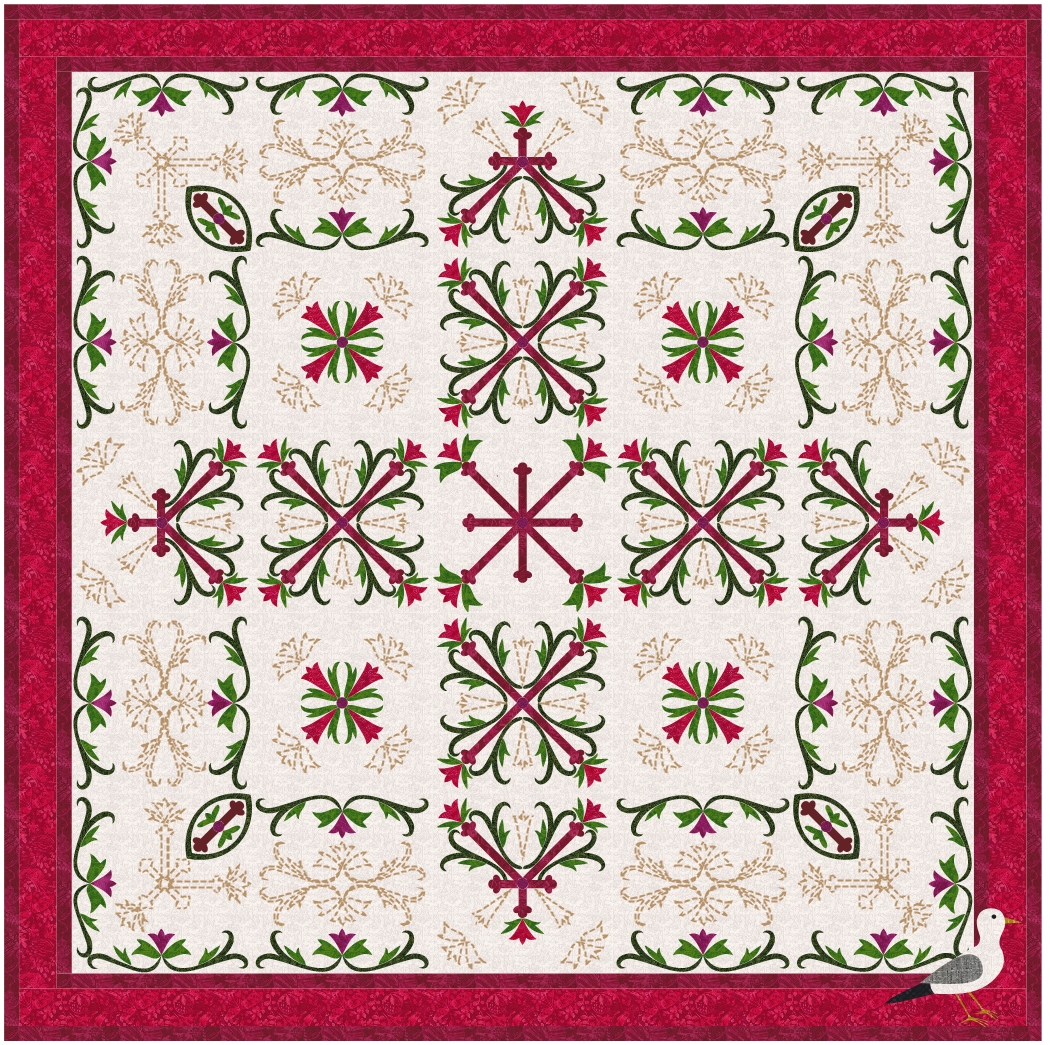
Love the second design, and would like it in most colourways I can think of.
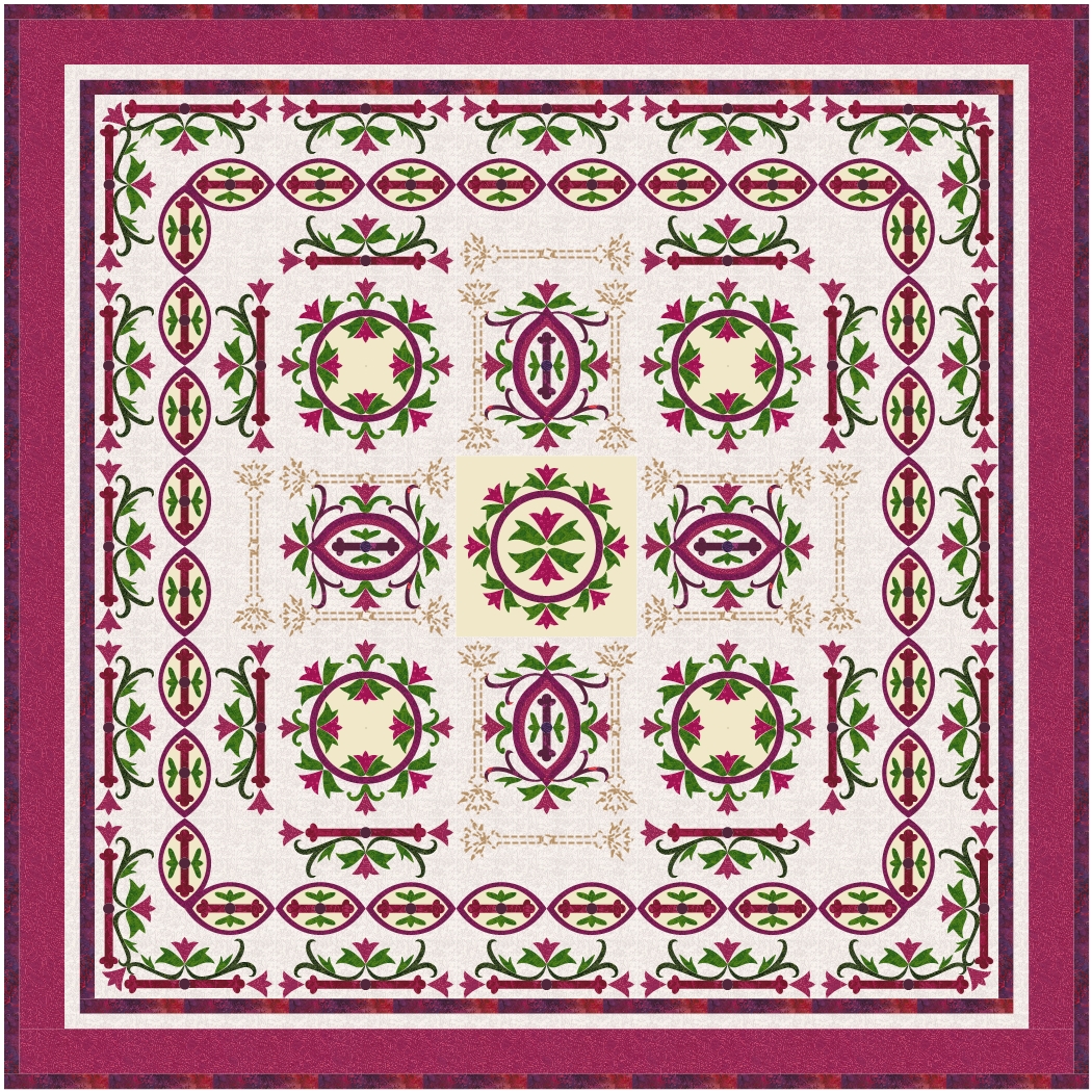
Love the third, but I think my favourite of these three is the middle one.
read more